Aromaleigh Brilliant Deductions Collection: Swatches

Brilliant Deductions baggiesToday I’m reviewing the Brilliant Deductions collection from Aromaleigh Cosmetics, which consists of 21 colors based on the BBC show Sherlock. The collection is being discontinued, but is currently available for 25% off while she still has it. I think the collection is a bit too large to be manageable, but it has some really nice colors in it.

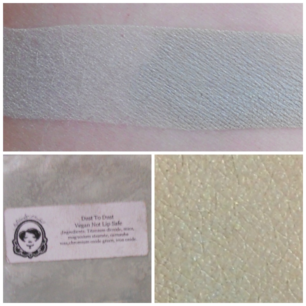
All colors are swatched over Urban Decay Primer Potion on the top/left and Fyrinnae Pixie Epoxy on the bottom/right. The top picture in each collage is taken in indoor natural light and the bottom one in direct sun.

Brilliant Deductions reds The Reds and Browns: Brainy is the New Sexy, Damaged & Delusional, Experimental Drug, Lucky Cat Emporium, Psychosomatic Limp, Sooo Changeable, Nicotine Patch

Brilliant Deductions GreensThe Greens and Blues: My Only Weakness, Bitterness is a Paralytic, Spectacularly Ignorant, Alone is What I Have, Pupils Dilated, Codes & Ciphers, High-Functioning Sociopath

Brilliant Deductions purplesThe Greys and Purples: Frailty of Genius,How Quaint, Fleeting Impression, Recreational Scolding, Password Protected, Surveillance Status, Glittering Career

Brainy is the New SexyBrainy is the New Sexy: “A very smooth English rose frost with golden highlights and tiny copper shimmers.” This is a cool toned pink with what looks to me like a hint of blue in the shimmer. On primer there’s a sheen rather than individual sparkles. Over Pixie Epoxy it becomes noticeably darker and the gold glitters come out more.

Damaged & DelusionalDamaged & Delusional: “A smooth plush burgundy wine frost with a striking gold highlight.” This is a gorgeous burgundy red with golden shimmer. It performs well over primer, but on a sticky base it becomes almost metallic in it’s finish.

Experimental DrugExperimental Drug: “A rich warm reddish brown with cool silvery iridescence of green, blue and violet.” This is an orangey reddy browny color with a strong sheen. Over primer the shimmer looks silvery blue, but over Pixie Epoxy some green comes out. It’s a touch sheer over primer alone, and darker over a sticky base.

Lucky Cat EmporiumLucky Cat Emporium: “A smooth cinnabar frost with bright shades of jade green.” This is a bright red-orange with lime green glitters. Over primer it looks almost like a matte base with chunks of sparkle, but over a sticky base it looks shimmery and metallic with even more glitter particles.

Psychosomatic LimpPsychosomatic Limp: “A smooth liquid metallic bronze with rose tones and bright sparks of green.” This is a very metallic light bronze. The sheen is very strong over just primer, and over Pixie Epoxy it really does look liquid. The sparks in this are very subtle. Most of the shimmer is metallic, not sparkly.

Soo ChangeableSooo Changeable: “A smooth taupe frost with golden highlights and interference shimmer of green and blue.” This seems like a light blackened bronze with a green shimmer overlay, kind of like brass that’s aged. Over Pixie Epoxy the sheen is very strong, which makes the color look lighter.

Nicotine PatchNicotine Patch: “A warm brown frost with iridescent gold and rose effects, and brilliant sparks of teal and blue.” This is a warm bronze with lots of blue and purple sparks. It was equally opaque over both bases.

My Only WeaknessMy Only Weakness: “A strong weathered gold with olive and khaki tones and tiny borealis shimmer.” This color is totally and completely different depending on the base you use. Over primer it’s a mattte khaki brown with red and grey tones to it. When I initially applied it, there was a layer of green/gold shimmer over the top, but it did not stick at all and just turned into fallout. Over Pixie Epoxy it’s a solid wall of golden olive green shimmer, with just the barest hint of brown base poking through.

Bitterness is a ParalyticBitterness is a Paralytic: “A plush warm green with fine lemon yellow shimmer and bright silvery sparks.” This is a yellow green with silver glitter. Over Pixie Epoxy it’s a bit metallic.

Spectacularly IgnorantSpectacularly Ignorant: “A deep low-sheen evergreen with brilliant sparks of warm yellow gold and cool silver.” This is a blackened forrest green, with gold and red sparks. Over a sticky base there’s an even gold sheen.

Alone is What I HaveAlone is What I Have: “A muted teal frost with soft grey undertones and bright sparks of chartreuse and silver.” This is a more blue than green medium teal with silver shimmer. It’s a little sheer over primer. Over Pixie Epoxy it is darker and very sparkly. I even some some gold sparks in it along with the silver shimmer.

Pupils DilatedPupils Dilated: “A frosted periwinkle blue with an intense golden iridescence and bright lemon gold highlight shimmer.” This is another color that it totally different over Pixie Epoxy. Over primer it’s a medium cornflower blue with the barest hint of gold shimmer. It was similar to My Only Weakness in that the shimmer initially showed up but then just sort of blew away. Over a sticky base the gold is very solid and only a hint of the blue base shows through.

Fleeting ImpressionFleeting Impression: “A soft, atmospheric twilight mauve with overall iridescence of gold, green and blue.” This is a light pinky purple with an iridescent shimmer that I can see the gold, green and blue in depending on the angle. Over Pixie Epoxy it’s more iridescent, with more of the green and blue apparent in the sheen.

Recreational ScoldingRecreational Scolding: “A vibrant medium grape purple with subtle aqua iridescence.” This is definitely a grape purple, but to me the shimmer is more green than aqua. Over primer alone it was a touch patchy. Over Pixie Epoxy it’s darker with more prominent shimmer.

Password ProtectedPassword Protected: “A muted warm mauve with coppery iridescence and bright golden sparks.” This is a warm reddish purple with a very strong gold/over shimmer. The shimmer is very apparent over primer alone. Over a sticky base the sheen is so solid it almost obscures the base, which makes it look more like a golden brown with slight reddish tones than a purple.

Surveillance StatusSurveillance Status: “A smooth saturated dark purple with lush rose and violet iridescence, and smoke tones.” This is a warm plummy dark purple, with a bit of shimmer. Over Pixie Epoxy it looks a little metallic, almost.

Glittering CareerGlittering Career: “A deep smokey grey with russet/violet tones and overall fine pink highlight shimmer.” I see this as a dark purple, not a grey. It’s a very dark purple, but the base is more of a warm brown than a black. The shimmer that comes out over Pixie Epoxy has a touch of red to it.

Codes & CiphersCodes & Ciphers: “A rich purplish grey with overall iridescent shimmers of peach and rose.” Over primer this is basically a charcoal black. On a sticky base it’s a purplish dark grey, with blue and pink shimmers.

High-Functioning SociopathHigh-Functioning Sociopath: “A lush smoked navy blue with bright and saturated sparks of sapphire blue.” I do not get any navy from this. To my eye it’s a very dark grey, almost black. Over Pixie Epoxy it becomes a metallic dark grey/black with tiny turquoise sparks.

Frailty of GeniusFrailty of Genius: ” A smokey cocoa frost with shimmering highlights of fuchsia and violet.” The description does not match the color as I see it at all. I see it as a concrete grey with pinky purple shimmer. Over primer the shimmer is very slight, but it forms more of a sheen over Pixie Epoxy. In sunlight a little bit of cocoa-ness peeks through as an undertone.

How QuaintHow Quaint: “A soft dove grey with violet-blue tones, and tiny shimmers of cobalt blue and copper.” This is a light grey with a bit of a violet tone to it and blue shimmer. Over primer the shimmer isn’t very strong, which makes it appear warmer, almost like there’s a touch of pink in it. Over Pixie Epoxy it’s darker and the shimmer is more apparent, which makes the grey pull cooler.

Overall Thoughts: I liked the formula for most of the colors. The way the top layer of shimmer fell out from Pupils Dilated and My Only Weakness was something I hadn’t experienced before and definitely disappointing since some of Aromaleigh’s other duochromes (like Experimental Drug) are quite nice. Beyond that the collection is just too big for my liking and I don’t really see how the colors fit with the inspiration from the TV show. Some of the colors are pretty similar and I wish she’d edited it down some before releasing it. I would recommend picking and choosing the shades that appeal to you rather than getting the whole collection because it’s a bit unwieldy all together. Most of the colors are brights or darks and there isn’t much in the way of lighter highlighting shades, which can make coming up with combinations a little tricky. I particularly liked Damaged & Delusional, Experimental Drug, Fleeting Impression, Alone is What I Have and Frailty of Genius.

Given the size of the collection, I had to do more than my usual five looks to use all of the colors. A couple have been featured on my blog before (including yesterday’s look), but most of them are new. Come back tomorrow to see them!

The looks are up here! I also did a tutorial using Frailty of Genius, Damaged & Delusional and Glittering Career.

Baroque Always With Me Collection: Swatches

Always With Me BagsToday I’m swatching the Always With Me collection from Baroque Cosmetics. The collection has eight colors based off of the film Spirited Away. I love Miyazaki and I feel like the shadows really capture the palette of the film. Very soft and pastel with a few fun pops of color. The formula on these is interesting. It’s sheerer than some other brands, especially over primer, but in a way that I find glowy and easy to blend.

Swatched over Urban Decay Primer Potion on the left/top and Fyrinnae Pixie Epoxy on the right/bottom. The top picture in each collage was taken in indoor natural light and the bottom picture was taken in direct sun.

Always With Me SwatchesAlways With Me Colors: Confetti Candy, Smells Like Human Spirit, Dragon, Ocean Railway, Herbal Bath Soak, Give Me Sen, Bathhouse, Boiler Room

Confetti CandyConfetti Candy: “White with red, gold and green sparks!” This is a sheer white with a lot of multicolored sparkles. I don’t think it performs well over Pixie Epoxy. I had to use a lot of shadow to get it opaque, but it got a little bit cakey and the surface wasn’t very even. But it works well as a highlight color, so its sheerness works for that.

Give Me SenGive Me Sen!: “A dusty purple with a satin finish.” This is a light greyed purple. It’s got a satin sheen but no sparkle and was sheer over primer. Over Pixie Epoxy it becomes darker and more grey, but also applied a little bit patchily.

Ocean RailwayOcean Railway: “A bright blue with green glitter.” This is a gorgeous sparkly turquoise blue. It’s sheer but full of sparkle over primer, but it really shines over Pixie Epoxy. On a sticky base it’s glorious and opaque and sparkly as fuck. I love it. If you need a knock out turquoise glitter shadow in your life, I highly recommend this one.

Herbal Bath SoakHerbal Bath Soak: “A medium tea green blue with a slight gold shimmer.” This is a slightly light blue with slight green and grey tones and a coppery gold sheen. It’s satiny though, without any actual sparkle. It’s pretty sheer over primer. Over a sticky base it’s darker, bluer and more opaque.

DragonDragon: “A minty green blue.” This is a lovely mint green with a satiny gold sheen. Like many of the colors in this collection, it’s sheer over primer and more opaque over a sticky base, but the color doesn’t really change much. There’s a tiny hint of sparkle.

Smells Like Human SpiritSmells Like Human Spirit: “A lime green with red glitter.” This is a bright lime yellow-green with a lot of red-orange sparkles. It reminds me of the color of Nickelodeon slime, so I think of it as slime green in my head. The sheerness over primer makes it way more wearable than I would have anticipated, and it’s actually one of my favorite colors from this collection. It makes for a really interesting inner corner highlight.

Boiler RoomBoiler Room: “A blackened bronze.” To me this is more of a straight ahead sparkly golden brown. It’s not terrible unique, but it’s nice. It’s more opaque over primer than the lighter shades in this collection. It looks very rich and takes on a touch of a blackened quality over a sticky base, with a strong gold sheen.BathhouseBathhouse: “A bright red with gold glitter.” This is a warm red with both a golden sheen and golden sparkle. It performs well over both bases. It’s glowier over primer and sparklier over Pixie Epoxy.

Overall Thoughts: Despite the sheerness, I really love this formula. It’s glowy and blendable and good if you want a less intense look. However, if what you’re looking for is full opacity, this might not be the right choice for you. I think the colors really match Miyazaki’s film well, complete with slightly muted quality and predominance of cool tones. All in all, I’m quite pleased.

I’m really glad the sun finally came out so I could swatch these! I finished my looks for this review ages ago and I’m looking forward to finally sharing them tomorrow!

The looks are up here.

Dark Matter Makeup Zodiac Collection: Swatches

Zodiac shadowsToday I’m reviewing the Zodiac Collection from Dark Matter Makeup. The shop is relatively new, but adding new collection quickly (all of which are space/science themed). This collection has 12 colors, one for each Zodiac sign. While the formula of some colors was a bit tricky, there were definitely a bunch of fun colors. Pretty much everything changed dramatically over a sticky base. It’s also worth noting that usually Dark Matter samples come in test tubes, not baggies. I asked Dom, the owner, if she could send me mine in baggies instead, and she was kind enough to do so for me.

(Update: I’ve been informed that Dom has reformulated these colors since I bought them, so the formula is supposed to be smoother now. So this review is for the original formulations of these colors.)

Swatched over Urban Decay Primer on the top/left and Fyrinnae Pixie Epoxy on the bottom/right. The top picture in each collage was taken in indoor natural light and the bottom one in direct sun.

Zodiac Purples The purpley colors: Cancer, Libra, Virgo, Gemini, Capricorn, Aquarius

Zodiac MiscThe other colors: Aries, Leo, Taurus, Scorpio, Sagittarius, Pisces

PiscesPisces: “A bold teal green with sparkling stars of silver glitter.” This is a bright turquoise with a matte base and silver glitter. It has a slightly powdery texture. Over primer it’s slightly sheer, but it does not play well with Pixie Epoxy. It balled up in some areas and flaked off in others, although the glitter was more noticeable and the color was darker. The PE side of my swatch also stained my arm quite a bit. I love the color of this over primer alone, but it sheers out a lot when you blend it, so I needed to pat a second layer on after blending in order to get a vibrant turquoise when I’ve used it in looks.

AquariusAquarius: “A duochrome that shifts from a dark, yet pure blue to a metallic gold.” This has a bright blue base and a strong gold duochrome overlay, with a bit of a coppery red twinge to it. Over primer the blue is sheer and pretty much all of the duochrome aspect of it vanishes, although there is still a bit of gold glitter. Over a sticky base I found I needed to work very fast to get an even overlay and even then there was a bit of patchiness in the gold. When I tried it over Pixie Epoxy on my eyes, the patchiness was worse. It’s a really pretty color, and I don’t own anything else like it, but it’s tricky to use.

AriesAries: “A light metallic gold with gold sparks. It also has an orange highlight that makes the color shift from a light to a more orange gold.” This is a quite nice light shiny gold with a bit of sparkle. I don’t see any orange in it. It’s really pretty and applies nicely. Over primer it’s a touch sheer, but I found that useful for looks when you want just a hint of gold. Over a sticky base, the sheen was quite even. It’s one of my favorites from the collection.

LeoLeo: “A sheer red orange with sparkles of silver and violet.” This is a glittery bright orange. Over primer it’s more of a true orange with just a bit of sparkle and a sheer matte base, but Pixie Epoxy brings out its red tones and makes the shimmer much more apparent. The pinky purple iridescence of the sparkle only comes out over a sticky base. Like Pisces, it blends away easily on the eyelids and I found myself touching it up after blending to get a more vibrant color.

LibraLibra: “A shifting magenta that has a metallic gold shift.” This is a bright magenta base with a strong coppery gold overlay that really comes out over Pixie Epoxy. Over primer the base is more purple toned with a bit of copper-gold glittery shimmer. Over sticky primer the gold forms a duochromesque layer over the top and makes the base look much warmer. It’s a really pretty color and much easier to apply than Aquarius. It’s unique in my collection as well.

CancerCancer: “Bright blue toned pink with blue shift.” This is a bright pink with bright blue shimmer. Over primer the base is sheerer and more hot pink and the blue shimmer is less prominent. Over a sticky base the color deepens and the blue comes out quite clearly .

VirgoVirgo: “A light pink that has a golden duochrome.” This is a very light lavender pink with golden iridescent shimmer. Over Pixie Epoxy, the base color was more purple and the shimmer was strong, but not strong enough for me to consider it a duochrome. Over primer it was more of a sheer pink with golden sparkle spread throughout.

GeminiGemini: “A purple maroon with red shimmering highlight.” This is a medium warm purple with multicolored red and purple shimmer spread throughout. It was a little bit sheer, especially over primer. It’s more reddish over Pixie Epoxy. It’s one of the most straightforward colors in the collection (which to me seems weird, since it was inspired by the twins.)

CapricornCapricorn: “A sheer satin victorian purple grey with very subtle hints of red.” This is a slightly greyish blue-toned light purple. It’s mostly matte but there’s a little shimmer mixed in. Over primer it’s more of a blueish lavender, but on Pixie Epoxy it’s darker and the blue-grey tones are stronger. It doesn’t show up in the picture, but when the light hits it just right there is the tiniest hint of red shimmer.

SagittariusSagittarius: “A gunmetal gray with intense silver glitter and subtle sparks of violet.” This is a dark grey with a whole ton of blueish silver glitter in it. Over a sticky base the glitter is quite dense, which gives it a blue sheen. It’s sheerer and more charcoal colored over primer, and the shimmery is more spread out.

Scorpio shiftScorpio: “A chocolate brown base with a duochrome of green turquoise.” This is a duochrome with a slightly blue-twinged green overlay on a reddish brown base. Over primer the base is very visible with just a sprinkling of green glitter, but over Pixie Epoxy the green forms a fairly solid duochrome layer over the top.

TaurusTaurus: “A true milk chocolate satin with soft hints of red and violet shimmer.” This is a basic chocolate brown base with red and purple shimmer that come out over a sticky base. Over primer it’s a bit sheer and not very shimmery, but over Pixie Epoxy it gets gorgeous reddish purple sheen that is quite pronounced. I think it would make a good liner. It was a little bit tricky to blend over primer.

Overall Thoughts: I have mixed feelings about this collection. On one hand there’s a lot of colors I like quite a bit, but on the other, the formula isn’t my favorite. Overall, these shadows are thinner and more powdery than I’m used to, which makes them a little bit tricky to work with. For most of the colors, you need to use a sticky base to bring out their most interesting qualities. However, I found that they worked better when my Pixie Epoxy was slightly wetter than usual, so I let it set for 12-15 seconds instead of my usual 15-20 and then worked very fast to pat the color on evenly. I also needed to have a lot of shadow on my brush to get even coverage. Over regular primer the colors are sheerer and more muted, and I found myself wanting to pat more color on after blending to make them brighter. (Especially with Leo, Capricorn and Pisces, which have more of a matte with glitter formula.) I wouldn’t use them with white brushes either, because they’re hard to wash out. (Pisces and Libra both took a couple washes to come out of my white haired pencil brush fully.) Unless you regularly use a sticky base and are comfortable taking the time to get the application right, it’s probably not a collection that you need. I would pick and choose the colors that appeal to you most instead. For me those would be Aries, Pisces, Libra, Cancer and Virgo. (Update: But, as I noted above, they’ve been reformulated since I bought them, so hopefully they’re less problematic now than they used to be.)

Even though the formula was tricky, I was able to make a bunch of really nice, bright looks with these colors. They’ll be up tomorrow!

Corvus Cosmetics Mouseia Collection: Swatches

Mouseia CollectionToday I’m reviewing the Mouseia Collection from Corvus Cosmetics. Corvus is a newer company, but it’s been really well received in the online indie community. The Mouseia Collection is based on the nine muses in Greek Mythology. It’s an intersting collection, because the colors are pretty extreme. There are very pale pastels and rich deep colors without any middle of the road medium shades. It’s worth noting as well that Noel sells mirrors featuring the label art from this collection as well. As always, I swatched over Urban Decay Primer Potion on the left/top and Fyrinnae Pixie Epoxy on the right/bottom. The top picture is taken in indoor natural light and the bottom in direct sun. Mouseia LightsThe pastels: Euterpe, Terpsichore, Thalia, Polyhymnia Mouseia DeepsThe deep colors: Clio, Calliope, Urania, Melpomene, Erato EuterpeEuterpe: “A creamy white highlight shade with a near-matte finish.” The muse of song. This is a soft, creamy eggshell color, with a hint of yellow. It has a bit of a sheen but no visible shimmer. TerpsichoreTerpsichore: “A soft, pastel pink with a slight shimmer.” The muse of dance. The description of this is spot on. It’s a slightly shimmer pastel ballet pink, which makes it very appropriate for the muse of dance. ThaliaThalia: “A pastel lavender shade with a slight shimmer.” The muse of comedy. This is a very pale pastel purple with a little shimmer. Over a sticky base, the white undertones of the base come through strongly. PolyhymniaPolyhymnia: “An icy silver-blue highlight shade with a slight blue shimmer.” The muse of sacred hymns. This color was previously released as a GWP called Ice Queen. This is a super pretty icy baby blue. In some lights the shimmer looks to me like it has a hint of pink. I definitely see why its previous incarnation was called Ice Queen. ClioClio: “A slightly blackened molten gold with a metallic finish.” The muse of history and lyre playing. Clio is a very rich, mustardy gold. It’s about as dark as gold can get while still being gold. It also makes a great liner, especially with blue eyes. CalliopeCalliope: “A dark, velvety green with a light green shimmer and subtle sparkle.” The muse of epic poetry. This is a pretty, sparkly forrest green. It’s a bit sheerer over primer than over a sticky base, but not as sheer as it’s showing up in my pictures. (I’m pretty sure I didn’t apply my primer evenly for this or Urania. The far end of the swatch, that doesn’t fit into the picture was a little more opaque.) Urania 2Urania: “A near-black navy base with a strong blue and turquoise shimmer, with gold and silver sparks.” The muse of astronomy. To my eye this is a bright, super sparkly navy. I definitely am not seeing a near-black base. A sticky base makes the sparkles in this come crazily alive. Over primer, it’s sheerer, but in person it doesn’t seem quite as sheer as it does in the picture. MelpomeneMelpomene: “A very dark brown-red with a slight red highlight.” The muse of tragedy. This color is gorgeous. It’s a dark reddish-brown purple. The pigmentation is good over primer, but a sticky base makes the red highlight really shine. This color makes a fantastic liner, right on the border between neutral and colorful. I love it. EratoErato: “A dark, shimmery, metallic burgundy with a soft coppery sheen.” The muse of lyric poetry. This is a really pretty burgundy, with amazing pigmentation over just primer. A Sticky base brings out more of the coppery-red overlay but doesn’t change the base color at all. If you’re in the market for a metallic dark red, this one is great.

Overall Thoughts: I really enjoyed this collection, but it isn’t designed to stand on its own, so I would recommend supplementing with some basic blending and midtone shades. That said, the extremes of the colors in this collection make it really distinctive. A lot of companies do collections with lots of medium shades, so this would be a good one to expand your repertoire if you’ve got lots of those hanging around. The pastels all apply really easily and look creamy, not chalky. The deep colors make a gorgeous rich, dark rainbow and work beautifully as liners. There isn’t a color in the bunch that’s difficult to work with. If the colors catch your fancy, I definitely recommend checking them out. Tomorrow I’ve got the looks to share with you. It was a bit of puzzle figuring out how to make the deep and the light colors work together, but I’m really happy with the looks I came up with!

You can check out the looks here.

Hello Waffle Painted Flowers Collection: Swatches

Painted Flowers bagsToday I’m reviewing one of my very favorite collections, the Painted Flowers collection from Hello Waffle. The Painted Flowers Collection is based on Alice in Wonderland (which I love) and has a mix of cheery springy colors and dark moody colors. It’s only available in the spring each year, but the best sellers (which I believe are Eat Me, Animate Chess-Piece, Dormouse and Gryphon) are available year-round. The collection originally consisted of fourteen colors, but three have been discontinued (Mad as a March Hare, Deepest Fears and Golden Afternoon) and one has been reformulated (Moonlit Grin). I’m including all the original colors and the original formula of Moonlit Grin in this review.

As always, swatches are over Urban Decay Primer Potion on the top/left and Fyrinnae Pixie Epoxy on the bottom/right. The top picture is taken in indoor natural light and the bottom one in direct sun.

Painted Flowers colorsThe light colors: Eat Me, Animate Chess-Piece, Mad, Golden Afternoon, Pool of Tears, Moonlit Grin and Beneath Oxfordshire.

Painted Flowers darksThe dark colors: Dormouse, Locked Doors, Mad as a March Hare, Gryphon, Rule 42, Deepest Fears and Hearts.

Eat MeEat Me: “Light satin white with a pink sheen.” This is a very pretty soft white with a pinky golden sheen. It’s fairly sheer over primer, but makes a great highlight shade.

Animate Chess-PieceAnimate Chess-Piece: “Pale dusty pink sheen with a touch of violet.” This is a sheer soft pink with a cool sheen and a bit of sparkle. When the light hits it the violet comes out and it’s super pretty. I would make a gorgeous one color look with a bit of black eyeliner.

MadMad: “Shimmery orange peach that leans copper with a gold undertone.” This is a surprisingly soft orange with a peachy tone to it. To my eye the sheen is more of a reflective white than a gold.

Golden AfternoonGolden Afternoon: “Sparkly golden yellow.” This is a bright sparkly yellow. It’s interesting because even though my camera didn’t really capture it, the sparkles are silver, not gold, which is unusual for a sparkly yellow. It becomes more goldenrod over a sticky base.

Pool of TearsPool of Tears: “Light blue with golden shimmer.” This color is gorgeous. It’s an aqua blue with golden sparkle. The sheen is incredibly strong over Pixie Epoxy. It’s probably my favorite blue I own.

Moonlit GrinMoonlit Grin: “Medium blue-green shimmer.” This is the original formula, not the reformulated version she’s selling now. It’s slightly greener than Pool of Tears, with a blue sheen instead of a gold one, but the two colors are incredibly similar, so I understand why she changed this one. The new version is a darker teal with purple sparkles.

Beneath OxfordshireBeneath Oxfordshire: “Vibrant forest green shimmer.” This is a beautiful shimmery dark green. Pixie Epoxy really brings out the shimmer and brightens the base color.

GryphonGryphon: “Muted bluish-gray taupe.” This is a light, silvery taupe. The base is a reddish brown (as you can see on the primer side of the swatch), with a bluish silver sheen over the top. It’s nice enough, but I feel like Hello Waffle makes a lot of colors similar to this.

Rule 42Rule 42: “Dark blue-ish grey shimmer.” Over a sticky base this is such a rich steely blue-grey. It’s weird that the primer side of the swatch is showing up quite as sheer and reddish as it is, because it doesn’t look like that to me in person. In person it’s definitely sheerer than it is over Pixie Epoxy, but it retains its bluish color. It’s behaved well when I’ve used it in looks over only primer, so I’m not quite sure why it’s swatching so poorly.

Deepest FearsDeepest Fears: “Dark gunmetal purple.” This is such a pretty shimmery grey-ish medium purple. It’s distinctly cool toned, with a steely dark silver sheen. It’s a shame it’s been discontinued because it’s gorgeous. It looks amazing in the crease with a lavender shade on the lid.

HeartsHearts: “Blackened red with red shimmer and red highlights.” This color is amazing over Pixie Epoxy but a little disappointing over primer alone. On a sticky base it’s a purpley blackened red with a bunch of shimmer. Over primer it becomes a sheer burgundy and the shimmer pretty much vanishes.

Mad as a March HareMad as a March Hare: “Reddish brown shimmer.” This is a rich reddish brown, with a bit of a coppery sheen. I’m not a huge fan of browns in general, but the red in this one makes me really like it. It’s a shame she doesn’t make it anymore.

Locked DoorsLocked Doors: “Dirty brown with gold shimmer.” This is a sparkly golden brown. Over Pixie Epoxy the sparkles are quite dense. I think this color makes my eyes look super blue when I wear it.

DormouseDormouse: “Pale sparkly taupe.” So much sparkle! To me this color looks like a light tan, not a taupe, and it’s chock full of silver sparkles, even over primer. Despite the sparkles, it makes for a good transition color on my skintone, and I wound up using it in three of the looks I did for this collection.

Overall Thoughts: As I said at the beginning, I love this collection. All of the colors are stunning over Pixie Epoxy and while a lot of them are sheerer over primer, in many cases that actually makes them easier to wear, because they’re not so in your face. I love the balance of the collection between the bright and deep colors, and I’m sad that the three discontinued colors aren’t a part of it anymore, because it makes it less rainbow-y. (Although I did snap up minis of them when Christine announced that they would be discontinued.) Golden Afternoon I could easily replace with another yellow, but Deepest Fears is one of my favorite cool purples and Mad as a March Hare is my favorite reddish brown. I think reformulating Moonlit Grin to make it more different from Pool of Tears is smart and I’ll probably pick up a jar of the new formula along with minis of the rest of the colors I don’t have. This is the only collection that I’ve wanted to upgrade all of my samples to bigger sizes, and I think that says a lot.

I love the variety of looks you can make with these colors. Tomorrow I’ll post five of them, a couple wearable neutral looks, a couple bright cheerful looks and one dark and moody look. I’ve also put together a tutorial showing how I made one of the looks, so stay tuned for that too!

You can find the looks here and the tutorial here!

My Pretty Zombie WTF Collection: Swatches

WTF samples

Today I’m reviewing the WTF collection, a little trio of neutrals from My Pretty Zombie. The story behind the trio is really cute, so I’m going to quote it from her site:

So my dear sweet innocent mom thought WTF meant “Wednesday Thursday Friday.” In honor of how awesomely cute that is, I created this set of neutrals. Perfect for your mom (who probably thinks the same thing) or any other sweet non eff word dropping lady in your life!

I love this! She also gives her mom 10% of the proceeds from this color, as payment for “teasing” her. Which is exactly the type of thing my mom would do too. Plus, the colors are super easily wearable and work really well together. I’m really happy with this little set.

Swatches! Urban Decay Anti-Aging Primer Potion on the top/left and Pixie Epoxy on the bottom/right. The top pictures are in indirect natural light and the bottom ones are in direct sun for the sparkle.

WTFW, T, F or Wednesday, Thursday, Friday.

WW (Wednesday): “The lighter version [of Thursday].” This is a sparkly, creamy white shade. This is a slightly mettalic creamy white. Depending on the lighting the sheen shifts from silvery grey to white gold. It’s slightly sheer over primer, and on bare skin it’s a delicate wash of sparkle. It would make a great highlight and is very brightening when used over the whole lid.

TT (Thursday): “A warm brown.” This is a coppery brown with a good sheen to it. It makes a great blending color. It didn’t show up much in my pictures, but in person there’s a slight greyish sparkle that makes it fit really well with the other two colors in the collection.

FF (Friday): “The darkest shade.” While it’s true that it’s the darkest shade in the set, it’s not the most helpful description. It’s a taupey silver that’s not too dark. It makes a great liner and also works well as a smoky eye.

Overall Thoughts: My Pretty Zombie seems to be better known for bolder colors, but these neutrals are great! It’s an incredibly cohesive collection of basics that work together really well. The colors are slightly sheerer and less metallic over primer than over a sticky base, but I think that actually works in their favor for creating toned-down work appropriate looks. I’m actually considering picking these up in full sizes, which I almost never do, because they’re just such useful colors. (Also, while they’re only listed on her site as a set, if you only want one, you can buy them individually as well. Just use the I just want one listing.)

Tomorrow I’ll be posting the looks. Just three instead of my usual five, since it’s such a little collection, but each shadow gets to be the centerpiece of its own look. It was really cool trying out different ways of combining the three colors.

Notoriously Morbid Slay Me Collection: Swatches (Waves 1 and 2)

Slay Me 1 and 2Today I’m reviewing Notoriously Morbid’s Slay Me collection, which is based on Buffy the Vampire Slayer, which I adore. This collection was released in waves, and today I’ll do 1 and 2. (3 and 4 will come later.) The entire collection is matte, which is unusual. Sadly, two of the colors have been discontinued, but I’m including them anyways for posterity’s sake.

Since these are mattes, I swatched them slightly differently than usual. The top/left half is over bare skin and the bottom/right half is over Urban Decay Anti-Aging Primer Potion. The top picture is in indoor natural light and the bottom one is in direct sun. The sun brings out a slight sparkle in some of the swatches, but they all looked matte on my eyes when I used them.

Wave 1Wave 1: Boca Del Infierno, Comic Relief, Teacher in Tweed, Hesitant Heroine, Quiet Storm and Gypsy Curse

Wave 2Wave 2: He’s Going Through Changes, She’s Got Gidget Hair, Dust to Dust, The Dating Slayer, She Names the Stars, Bloody Awful Poet

Boca Del InfiernoBoca Del Infierno: “A rich, deep oxblood.” This is a dark, rich burgundy blood red. It’s much darker and more opaque over primer than bare skin.

He's Going Through ChangesHe’s Going Through Changes: “A warm, gingery peach, as smooth as Oz’s fur.” This is a matte pinky peach. It’s very warm. On me it’s too warm to really using as a blending or transition shade (which I sillily keep trying to do), but it makes a nice lid color. It’s darker over primer, but the coverage is very even on bare skin.

Comic ReliefComic Relief: “A cheerful sunny orange.” This is a great matte orange. Sadly, it’s one of the colors that is no longer for sale. If you apply it lightly and blend it out it looks more peachy, but if you apply it with a heavier hand it’s definitely orange. It leans more red than yellow.

She's Got Gidget HairShe’s Got Gidget Hair: “A pale orange with a beige undertone.” This is a peachy tan. It’s similar to He’s Going Through Changes, but more yellow and less pink. It’s definitely a warm color and applies smoothly on bare skin.

Dust to DustDust to Dust: “An icy mint green with a gray/bone undertone.” This is a very pale green, with a whitish grey cast. Over primer it looks more grey-green and on bare skin it’s more white-green. It works surprisingly well as a highlight color for the browbone or inner corner in cool-toned looks.

The Dating SlayerThe Dating Slayer: “A bright sky blue – so Cordelia, so 90’s.” This is a matte baby blue. Over primer it becomes more sky blue. It’s a pretty dated color to my eye.

She Names the StarsShe Names the Stars: “A cool, blue toned purple as deep as Drusilla’s evil madness.” To me this reads as cornflower blue rather than purple, especially over primer. It’s sheer over bare skin and very slightly more purpley. It’s a really pretty color, but it’s been discontinued.

Hesitant HeroineHesitant Heroine: “A deep sapphire blue with an indigo tone in a matte finish.” Yet another matte blue. This one is darker and more cobalt. It’s much sheerer over bare skin than it is over primer, but I haven’t had any problems blending it. The fallout really does want to stain, though, so be careful when you apply it.

Quiet StormQuiet Storm: “A sweet baby pink with a gray undertone.” This is such a pretty lavender! It was tricky to photograph since it’s about the same level of lightness as my skin tone, just purple. Like most of the other pastels in the collection, it’s whiter over bare skin and more grey over primer. This is one of my favorite colors from the collection.

Gypsy CurseGypsy Curse:  “A warm-toned taupe, the exact color of the shadows Angel waits in.” This is a fantastic grey-brown color. It makes a great transition or crease shade, but it does not blend out well over primer, so using it can be a little tricky. I want to love it, cuz the color’s great, but it gets weird patches that won’t blend out when I use it over primer, so I’m torn. Primer doesn’t affect the color or saturation much, but it really does impact its blendability.

Teacher in TweedTeacher in Tweed: “An olive brown that practically screams librarian.” This is a slightly green tinted brown. The color is much darker over primer, and it has the same primer-induced blendability issues as Gypsy Curse.

Bloody Awful PoetBloody Awful Poet: “A cool-toned matte black, as cool as Spike’s leather trench coat.” This is a matte black. It’s solid black over primer and sheer charcoal black on bare skin. I love using a tiny bit on a liner brush to softly line my lower lashes. I get a ton of use out of this one. Plus, I love Spike, so points for that.

Overall Thoughts: I love Buffy and the connections to the characters are great, but this collection is a bit of a mixed bag for me. There are colors I love and will get a lot of use out of (like Bloody Awful Poet and Quiet Storm) alongside ones I won’t use very often (The Dating Slayer, I’m looking at you). The formula also strikes me as inconsistent. None of them were patchy, and all of them had a smooth texture. However some colors need a primer to improve their opacity and adhesion, but others blend better without one. Over time I think I’ll be able to figure it out, but it makes some pairings tricky (like when I used Boca Del Infierno, which is better with a primer, with Gypsy Curse, which is better without). I considered doing a separate review for each wave, but didn’t think I’d be able to make balanced looks with just one wave at a time, since Wave 1 is heavy on the deep colors and Wave 2 is primarily pastels. That said, I was happy with the looks I wound up putting together. These colors also make fantastic liners when mixed with Superstar Serum. I imagine I’ll most use these in conjunction with other shadows, cuz I like a bit of sparkle. But mattes are useful to have as part of my collection and the Buffy connections really do make me smile.

Stay tuned for the looks tomorrow! (Check them out here.)

Hello Waffle 1000 Likes: Swatches

DSCN6364 My next review is of Hello Waffle‘s 1000 Likes collection. This is a little collection with only seven colors, which Christine created to celebrate getting 1000 Likes on Facebook. The collection feels appropriately celebratory to me, cuz it’s pretty much a rainbow with gold sparkles.

Swatch time! As always, Urban Decay Primer Potion on the top/left and Pixie Epoxy on the bottom/right. The top picture is in indoor natural light and the bottom one is in direct sunlight.

1000 Likes SwatchesIt’s a rainbow! 23, One of Us!, Enabling, 1000 Likes, Empty Wallets, IMAM and Heavy Breathing Cat

2323: “Rose gold shimmer, more on the rosy side. [Christine’s] favourite from this collection!” This color is great. A nice rosy pink with a yellow gold sheen, which combine to make it look almost peachy. Over primer it’s more sparkly, and on a sticky base the sparkles form more of a sheen. It’s beautiful either way.

One of Us!One of Us!: “Dark mauve/plum with golden shimmer.” This is a really pretty plum, a little bit on the reddish side. The shimmery seems gold in some lights, but more coppery in others. It needs a sticky base for all of the shimmer to really shine. (I used this over pixie epoxy in a smoky eye with 23 to blend out the edges a little bit ago. It was stunning.)

EnablingEnabling: “Copper with gold shimmer.” This is a coppery orange with a strong metallic gold sheen. It has great pigmentation with or without pixie epoxy.

1000 Likes1000 Likes: “Dark gold shimmer.” Yep. It’s a dark gold. A little bit orangey. Very metallic. The warm orange tones make my blue eyes absolutely pop.

Empty WalletsEmpty Wallets: “Dark rich green with gold shimmer.” I see this as an olive green with a strong gold sheen to it. None of my pictures came out as green as it seems to me in person and I’m not sure why. It’s a little sheer without a sticky base.

IMAMIMAM: “Dark navy with gold sparkles.” IMAM is named after /r/indiemakeupandmore, the subreddit that brought me into the online indie community. It’s a dark navy blue with golden sparkles. Over pixie epoxy a strong metallic blue sheen comes out, which is gorgeous. Over primer it’s sheerer and less sparkly. It pairs beautifully with Heavy Breathing Cat.

Heavy Breathing CatHeavy Breathing Cat: “Golden silver shimmer.” This color is interesting in that it’s both silver and gold. It’s a steely silver base with golden shimmer mixed in. It performs well even without pixie epoxy.

Overall Thoughts: This is such a fun little collection! It’s colorful, but not too bright, and the golden sparkles running through the colors helps to tie everything together. The darker colors are a bit sheerer over primer but super shiny and opaque over pixie epoxy, and the lighter colors all work equally well over both bases.

I had so much fun making shimmery colorful looks with these! The looks’ll be up soon, like usual.

Check the looks out here.

Darling Girl My Three Witches Collection: Swatches

Darling Girl My Three Witches

Today I’m reviewing the My Three Witches collection from Darling Girl Cosmetics. It’s a ten shadow collection, based on the TV show Charmed. I definitely watched Charmed with my sister when we were younger and have a soft spot for the show. Unlike some of the other collections I’ve reviewed, this one is more subdued, with a lot of neutrals and more subdued colors. Everything is super sparkly, though! It’s worth noting that the website swatches are more intense and saturated than I found the colors to be. To my eye, it’s an entire collection of subdued shades with a lot of sparkle.

Now for the swatches. Everything is swatched in natural light, over Urban Decay Primer Potion on the top/left and Pixie Eposy on the bottom/right. The lower right picture in each collage is in direct sunlight. Everything else is indoor natural light.

My Three Witched ColorsThe colors: Painted World, Witch Way Now, Hell Hath No Fury and Re-Witched

My Three Witches NeutralsThe neutrals: Blinded by the Whitelighter, Scry Harder, Woogy, Just Harried and The Apocalypse, Not.

Re-WitchedRe-Witched: “Shiny bright yellow gold with yellow gold iridescence and sparkle.” The description for this is spot on. It’s a sparkly bright yellow gold. It’s by far the brightest color in the collection, but it applies much sheerer over just primer if you want something less intense

Love's a WitchLove’s a Witch: “Bronze pearl with pink undertones and a glint of pink sparkle.” To me this color is more of a reddish brown. In the bag it looks super red, but in looks it reads as a subtle reddish-orange brown on me.

Hell Hath No FuryHell Hath No Fury: “Rich, sizzling burgundy filled purple undertones and sparkle.” I see this as a subdued purplish red. Over pixie epoxy it becomes more magenta and has a much stronger sheen.

Witch Way NowWitch Way Now: “Pinky champagne beige.” This is a nice champagney pink with a fair bit of sparkle. It’s a type of neutral color that I love and find super easy to wear.

Painted WorldPainted World: “Warmed  pearly blue melded with khaki and silver tones and a scattering of blue sparkles.” I see this as a light blue with a silvery sheen, that turns warm in certain lighting. It feels like a Cinderella color to me, and is pretty sheer over primer.

Blinded by the WhitelighterBlinded by the Whitelighter: “A thousand orbs of silver dancing in the sunlight.” This is a straight ahead, slightly sheer sparkly silver. It works well in the inner corner.

Scry HarderScry Harder: “Gunmetal taupe with champagne tones.” I see this as a taupe with a green sheen. The sparkles in this one look almost purple. It’s noticeably more opaque and shiny over pixie epoxy, but it also stained my arm slightly blue where the pixie epoxy had been.

WoogyWoogy: “Deep brown with champagne tones.” This is a pretty straightforward sparkly brown. It’s the darkest color in the collection, but it’s still just on the deeper end of medium to me.

Just HarriedJust Harried: “Champagne with subtle blue sparkles.” This is a really pretty, easy to use champagne. It’s sheer over primer, but the sparkles still show up. The sparkles are sort of blue-violet, but their color is only noticeable if you look closely. This is the lightest color in the collection

The Apocalypse, NotThe Apocalypse, Not: “Rich antique gold with contrasting blue sparkles.” This is a bronzy tarnished gold color with big purple sparks. It’s almost equally pigmented over primer as over pixie epoxy. It’s one of my favorites since it’s so rich and the purple sparkle is unexpected.

Overall Thoughts: I think this would be a really good collection if you wanted something with a little bit of color and sparkle but that was still on the conservative side. All of the colors fit well together, but there’s not a lot of contrast. Most everything is medium-dark and everything has a very sparkly finish, which led to a fair bit of fallout during application. (But, this was only a problem for me during application, not when I was wearing them.) The looks I created all had a similar vibe, with a lot of simple, subtle looks. Nothing too crazy here! It’s also worth noting that the collection is no longer available in sample bags (at least all at the same time), since Susan now limits samples to five per order. The bags I got are a variety of sizes and thicknesses, with some being of noticeably better quality than others.

Stay tuned for the looks. They’re all easy and wearable, cuz that’s this collection’s thing.

And the looks are here!

Hello Waffle Musicians Collection: Swatches

DSCN3675Hello Waffle is one of my very favorite indies. Christine, the owner, is incredibly sweet and makes fantastic eyeshadows. I have so many of her colors and have yet to try one that wasn’t beautiful. Today I’m reviewing her Musicians Collection, with colors named after classical composers. The collection has a ton of rich, beautiful neutrals which remind me of musical instruments, along with some pretty pastels and a few bright sparkly colors. Overall, the collection is full of sparkles, with just one matte shade. The formula is lovely and easy to apply and blend.

Swatch time! All colors are over Urban Decay Eden primer on the top/left and Fyrinnae Pixie Epoxy on the bottom/right. The top picture in each collage is taken in indoor natural light, and the bottom right in direct sunlight.

Musicians Swatches 1The colors! Vivaldi, Chopin, Debussy, Tchaikovsky and Pachelbel.

Musicians Swatches 2The neutrals! Einaudi, Mozart, Schubert, Rachmaninoff, Bach and Bartok.

PachelbelPachelbel: “Sparkly white-gold, wedding-like.” This color is a beautiful shimmery white with yellow and gold tones to it. In the light, it has a bit of an iridescent sparkle to it. I think wedding-like is a perfect way to describe it.

MendelssohnMendelssohn: “Light pink with golden sheen.” Hello Waffle makes the best rose golds and this is no exception. It’s a light golden pink with a beautiful sheen and just the tiniest hint of green sparkle to go along with the gold. There are so many things to do with this color! It’s great all over the lid, but can work as a highlight to complement pretty much any of the warm or pastel colors in this collection.

Tcahikovsky 2Tchaikovsky: “Vibrant gold with red, silver, and blue sparks.” This is a straight up gold, with no other tones and a lot of sparkle. It applied like a dream and was super easy to blend too.

DebussyDebussy: “Soft pastel green with subtle golden highlights.” This is a super gorgeous light green with gold shimmer. It’s very pastel, but on top of a sticky base it takes on a slightly neon lime green quality. Honestly, I was super surprised I liked this one. I almost didn’t buy it at all because I thought to myself “what would I do with a lime green?” but without a sticky base, it’s much more delicate than that and I like it so much I’ve already ordered it in a bigger size! There’s not another color like this in my collection, and my pictures don’t capture everything I love about it.

ChopinChopin: “Romantic soft gray-purple duochrome.” To me this is straight up purple with no grey at all. Over primer, it’s very pastel and sheer with just a hint of blue overlay, but over pixie epoxy it becomes opaque with a strong blue shift. This color was the hardest to work with in the collection. If you want the bright purple/blue shift to show up, you really need a sticky base, but because of the contrast in opacity, blending it over a sticky base is tricky.

VivaldiVivaldi: “Copper red with silver sparkles. Caution: Sparkle-bomb” I love this color. It’s a very sparkly red, with cool tones and silver sparks. I don’t see any copper in it. It was a dream to work with too. Very easy to blend out the edges, so you don’t wind up with a harsh line of red, which makes it easier to wear than your average bright red.

BartokBartok: “Copper with bronze, gold, and red sparkle. Caution: Sparkle-bomb. One of [Christine’s] personal favourites.” This is a very bright copper, that reminds me of a shiny new penny. It’s interesting that she calls this a sparkle bomb, because for me this is more of a smooth metallic, with only a few discernable sparks. I see it as much more shiny than sparkly.

BachBach: “Neutral brown with copper duochrome.” If Bartok is a bright new penny, Bach is an old penny that’s somehow managed to age in color but keep it’s shine. It’s a rich red-brown copper, with a good sheen. The duochrome is a reddish shift and it’s super pretty. There are also the tiniest red sparkles. It darkens over a sticky base. It makes me think of violins and I want to try wearing it all over the lid with Rachmaninoff in the crease.

RachmaninoffRachmaninoff: “Matte espresso bean brown.” This is a matte, deep brown. The sparkle that you see in my swatch migrated from other shadows in the collection. Over primer there’s a hint of a red undertone to it, but over pixie epoxy (which it plays well with, even though it’s a matte) it becomes much cooler. It makes a great eyeliner and also works well to deepen the crease.

ShubertSchubert: “Muted blurple duochrome but darker, leaning almost brown.” I don’t even know what Christine’s description is supposed to mean, but I’m not sure I can do better. Schubert is kind of like what would happen if you took a red-brown base and layered a blue-silver overlay on top. Over a sticky base it gets a lot darker and the blue/silver aspects become more prominent. In the sun, it showed up a bazillion different colors and I was shocked that my pictures of it were all the same eyeshadow. It’s super complicated, but surprising wearable, and in the look I did with it, it functioned basically as a complicated silver.

MozartMozart: “Brown-toned silver.” This is a taupe brown silver. It reminds me of old armor, but with a bit of rainbow iridescence. The brown comes out at the edges, while the middle is more solidly silver. It pairs well with Schubert.

EinaudiEinaudi: “Sheer black with silver sparkle.” The black base is very sheer over primer, but not over pixie epoxy or when mixed with superstar serum. The sparkles are big and silver, but can catch the light in ways that make them look more colorful. It makes an excellent liner. As a shadow it works to darken the outer corner, but the sparkles don’t really show up and it takes a lot of blending. I think it could make a fun sparkly smoky eye, but I haven’t tried it.

Overall Thoughts: All in all, I really like this collection. The neutrals are fantastically rich and remind me of musical instruments and the pastels are soft and pretty. I love how the shadows really capture the feeling of the composer’s music, like how Pachelbel is delicate and pretty or how Tchaikovsky is full of epic grandeur. Chopin and Einaudi were more difficult to work with than the rest of the collection. Both of them were very sheer over primer but very dark over a sticky base and required more work to blend out. But if they’re colors you love (or if you want a sparkly black eyeliner) and you’re willing to spend a bit more time blending, I’d say they’re still worth it. The other ten colors are incredibly smooth and easy to apply and I would recommend them in a heartbeat.

As always, stay tuned for the looks I’ve created using this collection. Tomorrow I’ll put up five of them. Several are soft and neutral, but there are also a couple of statement looks in the mix.

The looks are now up here.