January Wrap-Up

PicMonkey Collage 2January was a really big month for me, beauty-wise. Most importantly, I started this blog! Reviewing collections and creating looks from them has given a structure to the way I do my make up. Instead of a what color do I wear today free-for-all, if I’m ever stumped for a day’s look, I can just choose from the collection I’m working on. Limiting my choices has stretched my creativity and is actually a ton of fun! I keep the colors of the current collection in mind and am coming up with new ways to combine them all the time. I also joined /r/indiemakeupandmore on reddit, which pulled me even farther down the indie rabbit hole, and gave me a community of people to talk to about my indies. (Which is good, cuz while he’s a great listener, my husband doesn’t have much to say on the topic.) It’s also led to my indie products featuring much more heavily in my rotation. I don’t think there’s been a day since I joined that there hasn’t been indie something or other on my face. So, now let’s take a look at the month as a whole.

PicMonkey Collage 5

Reviews: In January, I put up two reviews, for Shiro’s Tributes Collection and Hello Waffle’s Musicians Collection, and created 5 different looks for each of them.

January Favorites 2

Looks: I put 15 different looks up on the blog this month. Five were FOTDs, 5 were from the Tributes Collection and 5 were from the Musicians collection. I got more comfortable with red eyeshadow, which I’m starting to love. I even tried a couple of smoky eyes and wore bold lipstick once a week, which had been a goal of mine. My favorite looks are shown above. Because I’m me, all but one has winged liner. I love me some winged liner. From left to right:
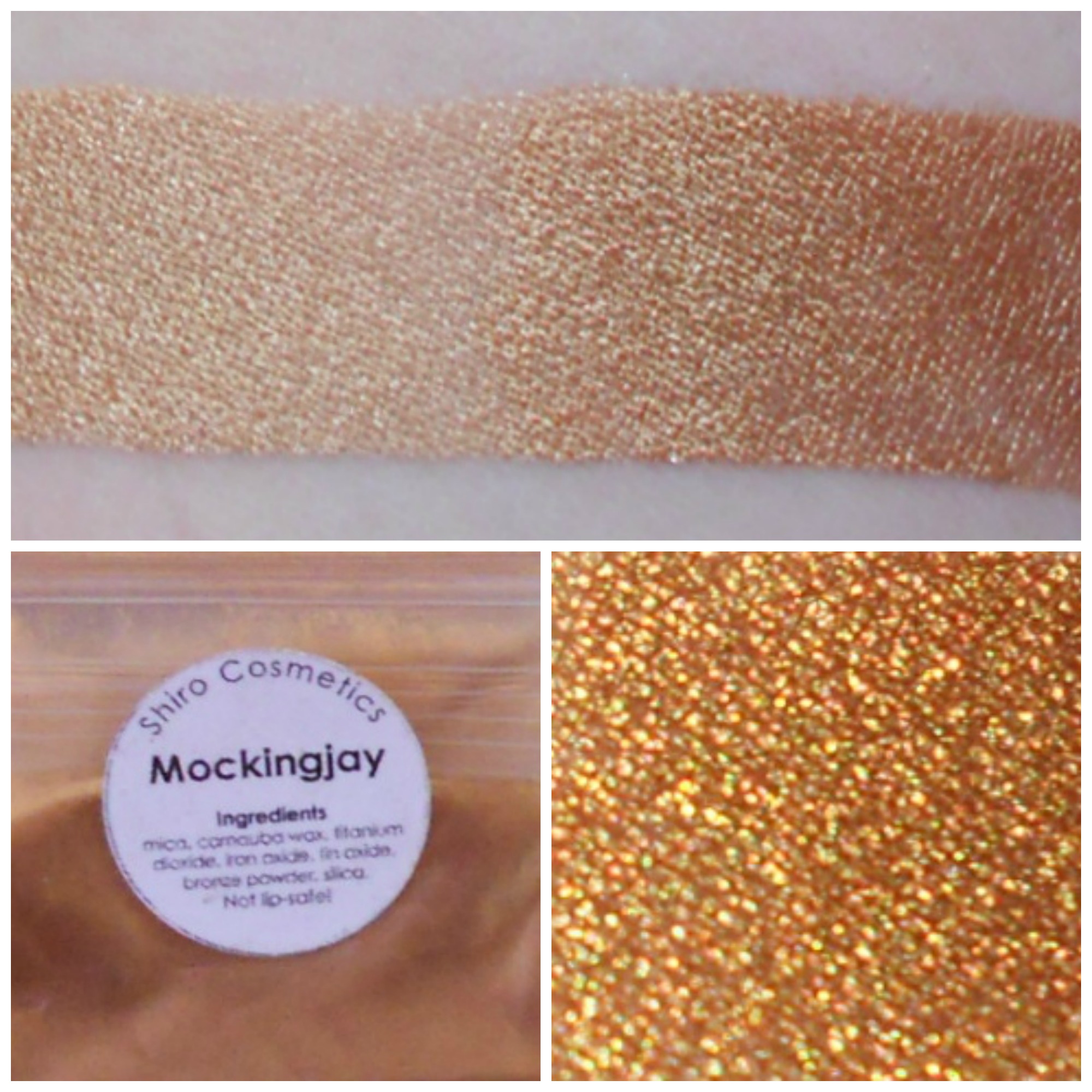
DSCN4083

Empties: These are the products I finished in January. I’ve started making a conscious effort to try to use up my samples, and I got through four of them this month.

  • MAC Face & Body Foundation in N1: This is the first foundation I’ve had that’s actually the proper color for me, and I love it for that. It’s a very thin formula, which makes for light, dewy coverage, which I like, although when it’s hot it definitely needs to be set with powder. At first I applied it with my fingers like the girl at the MAC counter showed me, but I think I prefer using a buffing brush. It makes it easier to get a thinner coat. If I apply too much it can get a little itchy, but powder helps and most of the time I don’t have a problem with it. I already have a new giant-size bottle of this. Also, if you have MAC empties too, it’s worth hanging on to them, cuz there’s a program called Back to MAC where you can exchange 6 empty containers for a free lipstick.
  • Urban Decay Primer Potion in Eden: This was the sample that wouldn’t end! I got over a dozen looks out of it and used it for both my swatch posts. I thought the little packet would dry up, but it didn’t. As a primer, I like it ok. It’s meant to be a “tawny matte” according to Sephora. It had a strong yellowish tone to it, and was pretty opaque. It worked fine to bring out the colors of the shadows and I don’t usually have problems with creasing, but I had to be careful around the edges, because if any of it didn’t get covered with eyeshadow, it was a noticeably different color than my skin. I don’t regret trying it, but I like sheerer primers better.
  • Jack Black Double Duty Face Moisturizer: I wound up with three little sample packets of this and have been using them up. It’s slightly thicker than my usual Olay lotion, but it moisturizes well. It has a kind of generic lotiony scent, which I don’t love, since I’m used to unscented lotion on my face. I won’t buy it, but I’d choose it as a sample from Sephora again, especially cuz I can get four uses out of each packet.
  • Greenwich Bay Trading Co. Fresh Milk Shea Butter Soap: I randomly picked this up at a specialty soap shop last time I was in America, but I really, really liked it. The milk scent was soft and creamy and fresh, and it was the perfect consistency for hand soap. It left my hands feeling nice. Plus the little bars were 3 for 4.25, which is a great price. I’d definitely buy this again and am looking forward to using the other scents I picked up.
  • The Body Shop Satsuma Shower Gel: I love this stuff. It smells exactly like orange jello. I’m already on to my next bottle of it and have a back up for after that runs out as well.
  • Lush Dirty Springwash: I really liked the sample of this I got. It’s spearminty and refreshing, which I love in a body wash. The mint feels great on my skin when it’s hot. The consistency is a little thin, so you need to make sure to add lots of water to your poof to get it to bubble up, but then it cleans well. I’d consider buying this.
  • Mint Chapstick: I have used countless tubes of this. It’s been my go-to lip balm for years, but lately I’ve been wishing it was more moisturizing and more strongly scented. I’ll use the rest of the tubes I have, but I’ve got a lot of indie balms coming to me to see if I can find something better.
  • The Body Shop Glazed Apple Body Butter: I got a sample of this and used it on my hands and feet. I like the Body Shop’s body butters as a before-bed lotion, but I didn’t care for this scent, even though I’m usually a fan of apple. This was too sweet and artificial (but not in a fun tart apple candy way) and also weirdly floral. Not a fan. If you like the scent, it does stick around a long time, though.

Orders: I ordered from eight different shops during January. Yay for spending Christmas money! I’ve got new eyeshadow brands, a ton of indie lip balms, a couple lipsticks, some bath stuff and my first indie perfumes coming. I’m most excited about my Baroque Eyeshadows, Haus of Gloi Pink Champagne-scented things and Ten Three Labs Salve Sticks, but something else could turn out to be my surprise favorite. You’ll just need to wait and see.

Next Month: In February I’ll continue to post a mix of random FOTDs and looks centered around a theme. However, in addition to looks using only eyeshadows from a single collection, I’ll also be posting looks that show different ways of using the same eyeshadow. I’ve also got a couple of tutorials focused on the type of super basic stuff that baffled me when I first started taking make up seriously. I’m really excited for it. In my quest to expand the kinds of make up I’m comfortable with (and so my blog’s not just a never ending stream of winged eyeliner and sheer lipstick), I want to do a few halo eyes and wear a bright lip color once a week. And, inspired by my accidental Gryffindor look, I’ll post looks for the other three Harry Potter Houses as well.

How’d January go for you? Do you have any beauty goals for February?

FOTD: Gryffindor Red and Gold

DSCN3455bThis is my favorite look from my Musicians Collection review, mostly because it was such a surprise how much I liked it, but also partly because my inner bookworm loves how much it screams Harry Potter. (The rest of the Houses will be coming soon.) I was looking through my stack of sample bags and I thought to myself “oooh, what if I put the red and gold together?” but honestly, I was expecting it be one of those “I tried. I guess I’ll go wash my face now” looks. But I loved it. The formula on these eyeshadows is so good that blending them was a dream, even with a fairly extreme color-switch. Hello Waffle wins for sure.

GryffindorPlus, it encouraged me to break out the red lipstick, and I’m definitely trying to find ways to wear bright lips more often.

DSCN3527Eyes:

Face:

  • MAC Face and Body foundation in N1
  • MAC Skinfinish Natural powder in Light
  • Laura Mercier Secret Concealer in 1
  • Tarte Amazonian Clay Blush in Natural Beauty

Lips:

  • MAC Ladybug

I started by priming my lids. Then I placed Vivaldi, a bright sparkly red, along the edge of my outer corner. Usually I work from the inner corners of my eye out when I do my eyeshadow, but because the red is so bright, I thought it would be better to put it on first. Then I used a flat brush to apply Tchaikovsky, a gold, starting at the inner corner and working my way to the red, not going past my crease. I added a little to the inner corner section of my lower lashline as well. At this point I stopped and said “huh, I think this’ll actually work.” Then I patted the excess red off my brush and very, very lightly blended it into the rest of my crease. Then I took a clean blending brush and went back and forth over the area where the red and gold shadows met and along my crease. I mixed Rachmaninoff, a dark matte brown, with Superstar Serum, and used an angled brush to apply it as liner, winging it out on the top, and lightly lining the bottom, skipping the very inner part, and connecting it to the top line at the outer corners. I curled my lashes and applied mascara. At this point, I wasn’t quite sure what to do with the rest of my face, and decided to go all in on the red and finished with red blush and red lipstick.

I love how well this came together, and how blue the red and gold make my eyes look. I’m not quite sure where I would wear this look other than just around the house or with my husband, but I kinda want to find an event for it. Also, now that I’ve created a Gryffindor look, I’m starting a little Harry Potter House Series, so keep your eyes peeled for Ravenclaw, Slytherin and Hufflepuff looks.

Hello Waffle Musicians Collection: Looks

Musicians close ups 2

Pachelbel, Mendelssohn, Bach, Vivaldi, Chopin, Mozart / Debussy, Tchaikovsky, Bartok, Rachmaninoff, Schubert, Einaudi

Yesterday I posted my swatches of Hello Waffle’s Musicians collection, and today I’m sharing the looks I’ve created using this collection. This collection has a ton of rich, beautiful neutrals which makes it very easy to come up with everyday looks, but the pops of color mean that you can go bold as well. I’ve come up with a couple dramatic looks and a few more easily wearable ones. While I created five looks for this post, I feel like there are a ton of other combinations I could have chosen instead.

DSCN3568Look 1: Bartok, Bach, Mendelssohn and Rachmaninoff

Musicians 3 I primed my lids and patted Mendelssohn onto the inner half of my lid, then flipped my brush over and applied Bartok to the outer half and blended the two together to make a seamless gradient. Then I worked Bach into the outer corner and crease and below my lower lashes using a stiff, flat brush. I lined eyes with a dark brown eyeliner, and went over it with Rachmaninoff. I worked Rachmaninoff the tiniest bit upwards into the outer corner of my crease. I lightly highlighted my browbone with Mendelssohn and finished with mascara for an easy to wear warm neutral look.

DSCN3527Look 2: Tchaikovsky, Vivaldi and Rachmaninoff

Musicians 2I started by patting Vivaldi into the outer corner of my already primed lids. Then I added Tchaikovsky to inner part of my eyelid, stopping when I reached the red. I also put a little bit in the inner corner. Then I put a very tiny amount of Vivaldi on my brush and blended it into the crease, making sure to keep it from being too dark or harsh. I used a clean blending brush to blend the red and gold together. I mixed Rachmaninoff with Superstar serum and applied it as winged liner with an angled brush, making the wings into thicker than usual triangles. I used the remaining Rachmaninoff mixtures to line the out 2/3 of my bottom lashes, connecting it to the wings at the outer corners. I finished the look with mascara and red lipstick.

DSCN3024Look 3: Debussy, Chopin, Mendelssohn and Pachelbel

Musicians 1Maybe don’t try this look unless you’re super comfortable with your blending skills and want to look like a glittered, slightly neon easter egg. I primed my lids, then patted on Debussy. I put Chopin into the crease and outer corner and attempted to blend into Debussy. I patted Pixie Epoxy over the solid purple area and applied more Chopin on top and blended again. Then I applied more Pixie Epoxy on top of the green and did the same with Debussy. I blended out the edges with Mendelssohn, up to my browbone. This was honestly just too shimmery so I toned it down with some matte skin-toned shadow on top. I used Pachelbel to highlight my inner corner and under my brow. I put some Debussy along the rest of my lower lashline. I lined my eyes, drew on my wings and applied mascara on my upper and lower lashes. Then I blended some more.

DSCN3670Look 4: Mozart, Schubert, Einuadi

Musicians 4For this, I put Mozart in the center of the lid, with Schubert on either side of it. I made sure that neither color went up past my crease, and smoothed out the edge with a clean brush. I mixed Einaudi with Superstar Serum and lined my upper and lower lids. Then I used the same brush to place dry Einaudi (not mixed with the serum) on top.

DSCN3942 Look 5: Pachelbel and Einaudi

musicians 5This look pretty much couldn’t be simpler. It’s just Pachelbel all over the entire lid and up to the brow and Einaudi mixed with Superstar serum as winged liner. And then Einaudi along the outer 2/3 of the bottom lashes and Pachelbel for the inner third. I needed a plain black and white look to remind me of piano keys and sheet music. Also, I love white eyeshadow. Too often it gets relegated to serving only as a highlight, but I love it on its own!

Musicians 5 b

As a bonus extra look (mostly because I was curious about how Einaudi would work as a shadow, not just as a liner), I went back and popped a bit onto the outer corner and blended it. It’s pretty much the same, just with some grey.

Musicians looks

These are my five Musicians collection looks. I think the second one might be my favorite. I was really surprised at just how well the red and gold blended together, but both Vivaldi and Tchaikovsky have an exceptional formula that made it super easy to make a seamless transition. This makes me want to find more times to wear red eyeshadow! (Also, dorky side note: This look screams Gryffindor to me. But I’m solidly Ravenclaw.) I really love the first look as well. It’s the type of neutral look that makes me feel super pretty while not drawing too much attention. Which look is your favorite?

Hello Waffle Musicians Collection: Swatches

DSCN3675Hello Waffle is one of my very favorite indies. Christine, the owner, is incredibly sweet and makes fantastic eyeshadows. I have so many of her colors and have yet to try one that wasn’t beautiful. Today I’m reviewing her Musicians Collection, with colors named after classical composers. The collection has a ton of rich, beautiful neutrals which remind me of musical instruments, along with some pretty pastels and a few bright sparkly colors. Overall, the collection is full of sparkles, with just one matte shade. The formula is lovely and easy to apply and blend.

Swatch time! All colors are over Urban Decay Eden primer on the top/left and Fyrinnae Pixie Epoxy on the bottom/right. The top picture in each collage is taken in indoor natural light, and the bottom right in direct sunlight.

Musicians Swatches 1The colors! Vivaldi, Chopin, Debussy, Tchaikovsky and Pachelbel.

Musicians Swatches 2The neutrals! Einaudi, Mozart, Schubert, Rachmaninoff, Bach and Bartok.

PachelbelPachelbel: “Sparkly white-gold, wedding-like.” This color is a beautiful shimmery white with yellow and gold tones to it. In the light, it has a bit of an iridescent sparkle to it. I think wedding-like is a perfect way to describe it.

MendelssohnMendelssohn: “Light pink with golden sheen.” Hello Waffle makes the best rose golds and this is no exception. It’s a light golden pink with a beautiful sheen and just the tiniest hint of green sparkle to go along with the gold. There are so many things to do with this color! It’s great all over the lid, but can work as a highlight to complement pretty much any of the warm or pastel colors in this collection.

Tcahikovsky 2Tchaikovsky: “Vibrant gold with red, silver, and blue sparks.” This is a straight up gold, with no other tones and a lot of sparkle. It applied like a dream and was super easy to blend too.

DebussyDebussy: “Soft pastel green with subtle golden highlights.” This is a super gorgeous light green with gold shimmer. It’s very pastel, but on top of a sticky base it takes on a slightly neon lime green quality. Honestly, I was super surprised I liked this one. I almost didn’t buy it at all because I thought to myself “what would I do with a lime green?” but without a sticky base, it’s much more delicate than that and I like it so much I’ve already ordered it in a bigger size! There’s not another color like this in my collection, and my pictures don’t capture everything I love about it.

ChopinChopin: “Romantic soft gray-purple duochrome.” To me this is straight up purple with no grey at all. Over primer, it’s very pastel and sheer with just a hint of blue overlay, but over pixie epoxy it becomes opaque with a strong blue shift. This color was the hardest to work with in the collection. If you want the bright purple/blue shift to show up, you really need a sticky base, but because of the contrast in opacity, blending it over a sticky base is tricky.

VivaldiVivaldi: “Copper red with silver sparkles. Caution: Sparkle-bomb” I love this color. It’s a very sparkly red, with cool tones and silver sparks. I don’t see any copper in it. It was a dream to work with too. Very easy to blend out the edges, so you don’t wind up with a harsh line of red, which makes it easier to wear than your average bright red.

BartokBartok: “Copper with bronze, gold, and red sparkle. Caution: Sparkle-bomb. One of [Christine’s] personal favourites.” This is a very bright copper, that reminds me of a shiny new penny. It’s interesting that she calls this a sparkle bomb, because for me this is more of a smooth metallic, with only a few discernable sparks. I see it as much more shiny than sparkly.

BachBach: “Neutral brown with copper duochrome.” If Bartok is a bright new penny, Bach is an old penny that’s somehow managed to age in color but keep it’s shine. It’s a rich red-brown copper, with a good sheen. The duochrome is a reddish shift and it’s super pretty. There are also the tiniest red sparkles. It darkens over a sticky base. It makes me think of violins and I want to try wearing it all over the lid with Rachmaninoff in the crease.

RachmaninoffRachmaninoff: “Matte espresso bean brown.” This is a matte, deep brown. The sparkle that you see in my swatch migrated from other shadows in the collection. Over primer there’s a hint of a red undertone to it, but over pixie epoxy (which it plays well with, even though it’s a matte) it becomes much cooler. It makes a great eyeliner and also works well to deepen the crease.

ShubertSchubert: “Muted blurple duochrome but darker, leaning almost brown.” I don’t even know what Christine’s description is supposed to mean, but I’m not sure I can do better. Schubert is kind of like what would happen if you took a red-brown base and layered a blue-silver overlay on top. Over a sticky base it gets a lot darker and the blue/silver aspects become more prominent. In the sun, it showed up a bazillion different colors and I was shocked that my pictures of it were all the same eyeshadow. It’s super complicated, but surprising wearable, and in the look I did with it, it functioned basically as a complicated silver.

MozartMozart: “Brown-toned silver.” This is a taupe brown silver. It reminds me of old armor, but with a bit of rainbow iridescence. The brown comes out at the edges, while the middle is more solidly silver. It pairs well with Schubert.

EinaudiEinaudi: “Sheer black with silver sparkle.” The black base is very sheer over primer, but not over pixie epoxy or when mixed with superstar serum. The sparkles are big and silver, but can catch the light in ways that make them look more colorful. It makes an excellent liner. As a shadow it works to darken the outer corner, but the sparkles don’t really show up and it takes a lot of blending. I think it could make a fun sparkly smoky eye, but I haven’t tried it.

Overall Thoughts: All in all, I really like this collection. The neutrals are fantastically rich and remind me of musical instruments and the pastels are soft and pretty. I love how the shadows really capture the feeling of the composer’s music, like how Pachelbel is delicate and pretty or how Tchaikovsky is full of epic grandeur. Chopin and Einaudi were more difficult to work with than the rest of the collection. Both of them were very sheer over primer but very dark over a sticky base and required more work to blend out. But if they’re colors you love (or if you want a sparkly black eyeliner) and you’re willing to spend a bit more time blending, I’d say they’re still worth it. The other ten colors are incredibly smooth and easy to apply and I would recommend them in a heartbeat.

As always, stay tuned for the looks I’ve created using this collection. Tomorrow I’ll put up five of them. Several are soft and neutral, but there are also a couple of statement looks in the mix.

The looks are now up here.

FOTD: Reddish-Brown Smoky Eye

DSCN4065 Today I let my husband suggest my make up and he chose a shiny brown smoky eye, so that’s what I did. I’m kinda glad he suggested it, because smoky eyes are not my usual thing, so it’s nice to stretch myself outside of my comfort zone. I really like how the reddish-brown looks with my red glasses, though. reddish brown smoky I kept it light, so it’s pretty wearable, but it took a lot of will power to keep myself from adding a swipe of eyeliner at the end. DSCN4041 Eyes:

  • Hello Waffle Mad as a March Hare
  • Hello Waffle Bach
  • Shiro Doge
  • Stila Bare (from the In the Light Palette)
  • Urban Decay Primer Potion in Eden
  • Urban Decay 24/7 liner in Roach
  • Benefit They’re Real Mascara

Face:

  • MAC Face and Body Foundation in N1
  • Laura Mercier Secret Concealer in 1
  • MAC Skinfinish Natural in Light
  • Tarte Exposed Blush

Lips:

I primed my lids, then sloppily applied a reddish brown eyeliner all over my mobile lid and along my lower lashes. I blended it out with my smudge brush. Over the top I put Mad as a March Hare a slightly shimmer red-brown. I blended out the crease using Bach, a copper, and applied some along the lower lashes as well. I used a matte skin-colored shadow to blend out the transition shade. Then I applied Doge, a light pinky-tan highlight shade, in the inner corner and along my waterline. I curled my lashes and piled on the mascara. My face make up was the same as always, with a pinky-brown nude blush and With Eyes Unclouded, a brownish red tinted balm, on my lips. I’m glad my husband pushed me to try this, cuz I think it turned out well, but isn’t what I would have chosen on my own. I really love Bach and was glad to use it again, even though I’ve finished up my Musicians collection review. (Swatches from it will be up tomorrow and looks on Friday.) I’m slowly getting used to smoky eyes, although it’s still weird to me to not have a discernable line of liner along my lashes.

FOTD: Lemon Lime Eyeshadow

DSCN2172I built this look around Debussy, a light golden green from Hello Waffle’s Musicians collection (which is the next review I’ll be putting up later this week). When I put it on, I wasn’t quite sure what to pair it with, but I wound up grabbing a yellow and a green, to make a bright, citrusy look. Lemon Lime Once again, this look is quite bold on it’s own, but very wearable with glasses.

DSCN2205

Eyes:

Face:

  • MAC Face and Body Foundation in N1
  • Laura Mercier Secret Concealer in 1
  • Shiro Fatality Finishing Powder
  • Shiro Gelato Beach Blush

Lips:

  • MAC See Sheer

I started with primer, like usual and then patted Debussy, a light green with a golden sheen, all over my lids. I added Golden Afternoon, a bright yellow with gold sparkle, on the inner third of my lid, and around to the inner third of my lower lashline. Then I added Shiro’s That’ssss a Nice House, a bright grass green, to the outer part of my crease. That was just too bright, so I applied Envy, a much darker green, over the top and blended it down toward my outer corner. I added my usual winged liner, but forgot mascara. (Oops!) My face products were the same as usual, but I wanted a bright blush and lipstick to balance out the eyes, so I went with bright coral. I blended Gelato Beach blush onto my cheeks, concentrating on the upper/outer corners of my cheeks. (Do cheeks even have corners?) I finished off with See Sheer lipstick.

I felt so bright and citrusy! I loved it. And then the Wisconsinite in me realized I had totally just made Packers make up. Womp womp.

FOTD: Hello Waffle’s Wearable Taupes

DSCN2037

So this is the very first look I ever attempted taking pictures of for the blog. Easy, wearable, pretty taupes. Nothing fancy, but I thought I’d share it, for an easy back-to-work Monday look.

Wearable taupeI hadn’t yet figured out that looking down is better than closing your eyes for taking pictures of shadow placement.

DSCN1986Eyes:

  • Hello Waffle Walternate 2.0
  • Hello Waffle Bishop
  • Hello Waffle Dormouse
  • Lorac Behind the Scenes primer
  • Urban Decay 24/7 liner in Crave
  • Maybelline Great Lash mascara

Face:

  • MAC Face and Body Foundation in N1
  • Laura Mercier Secret Concealer in 1
  • MAC Skinfinish Natural in Light
  • Shiro 1-Up Blush

Lips:

I applied primer, and then put Walternate 2.0, a shimmery taupe, all over my lid. I then put Bishop, a very slightly darker shimmery taupe, on the outer and inner parts of my lid, kind of like a very subtle halo. I then blended out with Dormouse up to my brow and applied it my lower lashline as well. I applied a dark brown/black eyeliner to my upper lashline and the outer part of my lower lashline and smudged it out with a brush. I curled my lashes and applied mascara. I did the rest of my face as usual, with 1-Up blush on my cheeks. I started by applying It’s Called Love, a bright coral pink balm, but decided it was too bright and blotted it off. I put Come Out, Come Out, a pretty apricot over the stain.

I really like this as a basic, wearable look. Bishop and Walternate 2.0 are basically the exact same color, but one is very slightly darker than the other, which makes the contrast between them very subtle, but I like it.

FOTD: Shiro Silver and Navy Winged Liner

DSCN2695I included this look in my Tributes Collection post yesterday, but I love it so much, it gets its own too! Seriously, I’ve worn this look several times now and I love love love it. It’s pretty and fancy but not too much for an average day. It’s pretty much perfect. Plus, it’s a basic enough 2 color look that it could work with almost any combo of coordinating light and dark colors. I really like using the darker color both in the crease and as liner. To me it feels very put-together.Huntress lookTo top it off, it photographs really well too. Next time I have a wintery party to go to, this is probably what I’ll do.

DSCN2747

Eyes:

Face:

  • MAC Face and Body Foundation in N1
  • Laura Mercier Secret Concealer in 1
  • Benefit Boi-ing concealer in 01
  • MAC Skinfinish Natural in Light
  • Shiro 1-Up Blush

Lips:

  • Urban Decay Revolution lipstick in Naked

I started by putting primer all over the lid, then patted Huntress, a light silver, on top, concentrating it on the inner part of the eyelid. Then I used a fluffy, tapered brush to work Rebellion, a navy, into the crease, concentrating on the outer corner. I pulled this down to the outer corner of my eye, making sure not to get it too dark. Then I mixed Superstar Serum and Rebellion to make a paste and used a pointed brush to apply the mixture as winged liner. I curled my lashes and put on mascara. My face products were the same as usual, except for a double dose of concealer under the eyes (I did not sleep well at all the night before). I applied Shiro’s 1-Up, a peachy blush, making sure to keep it high on the tops of my cheekbones and finished with a pale pink lipstick.

As I said, I love this look. It’s very wintery and beautiful. If I ever need to go to an elegant wintertime ball, I’m set.

Also, I joined Bloglovin, so you can follow me there if you want.

Shiro Tributes Collection: Looks

Tributes Close Ups

Unforgettable, Girl on Fire, Baker’s Boy, Remake, Beyond the Fence, Star-Crossed / Wildflowers, Ever in Your Favor, Mockingjay, Cornucopia, Huntress, Rebellion

In my previous post, I swatched Shiro’s Tributes Collection, which is based on the Hunger Games. Now I want to share some looks I’ve done using this collection. There are so many blogs out there that have amazing swatch pictures, but I always want to know people actually use their collections and what the shadows look like on real people’s faces. So here are 4 looks I’ve done using only these shadows. (Including one with a day to night variation!)

DSCN2451Tributes Look 1: Unforgettable, Girl on Fire, Cornucopia and Remake

Tributes look 1Unforgettable on the lid, Girl on Fire in the crease, Cornucopia blended up to the brow and Remake in the inner corner. I also put Unforgettable on the outer third of the lower lashline, Girl on Fire on the middle third and Cornucopia on the inner third, with a bit of Remake on top. I lined my eyes with black liner, and smudged it, going slightly upwards at the outer corner and applied mascara to finish it off.

DSCN2747Tributes Look 2: Huntress and Rebellion

Tributes look 2For this, I patted Huntress all over the lid. With a fluffy, tapered brush I placed Rebellion in the crease, concentrating the color at the outer corner and angling it down towards the eye, being careful not to make it too dark. Then I mixed Rebellion with Superstar Serum, and applied it as a winged liner. Curled lashes and mascara and done! I love this look. I’ve worn it multiple times and I always feel gorgeous when I do. I think the same basic approach would work with one of the golds on the lid and Star-Crossed as liner as well, but I haven’t tried it yet.

DSCN2888Tributes Look 3: Baker’s Boy and Wildflowers, with Mockingjay and Ever in Your Favor added for a night look

Tributes 3 DayBonus day to night look! For the day look, I applied Baker’s Boy lightly to primed lids, then put Wildflowers in the crease. I used dark brown liquid eyeliner to make a tiny little wedge-shaped wing, and applied mascara. I love this look. So soft and easy to wear. Another one I’ve worn multiple times. These colors are just perfect for my coloring.

Tributes 3 Night 2To change it into the night look, I darkened the outer corner with Ever in Your Favor and used a small brush to apply some under the lower lashes as well, sticking to the outer 2/3 of the eye. Then I put Mockingjay along my lower waterline. I put some in my inner corner and very carefully traced a line just above my liner on the inner 3/4 of my eye, stopping before I got to the wing. And I added bright magenta pink lipstick!

DSCN2962Tributes Look 4: Beyond the Fence, Star-Crossed, Baker’s Boy, Remake

Tributes 4 2For this, I primed my entire eye area, including underneath, then patted Beyond the Fence all over my lids, flaring it up at the corners (because that’s what’s most flattering with my eye shape), and underneath my lower lashes, making sure to connect the outer corners. I lined my eyes heavily with black pencil liner and used a brush to smudge it onto my mobile lid and along my lower lashes. Then I patted Star-Crossed over the top of the liner. I applied a thin line of Pixie Epoxy along my upper lashes and put more Star-Crossed on top. I blended out the edges using Baker’s Boy (a matte shadow that matches your skin tone would also be great to use for this, but I was sticking to the colelction), and added a tiny dot of Remake in my tear ducts to brighten things up. Then I curled my lashes, added lots of and blended out the edges with a clean blending brush one last time.

5 tirbutes looks 2So there you have it! 4 very different looks using only shadows from Shiro’s Tributes Collection.  Which one’s your favorite? Personally, I like the third look the best. It’s so simple and pretty and the type of thing I can wear all the time. I might need to get myself full sizes of Baker’s Boy and Wildflowers so I don’t run out!

Shiro Tributes Collection: Swatches

DSCN2232Shiro Cosmetics’s Tributes Collection is based on The Hunger Games. I love the Hunger Games and the collection has a range of pretty colors, so the Tributes collection was one of the two I picked up in my very first indie order. Shiro’s eyeshadows have a fantastic formula, and these are no exception. The collection has a good range of colors that work well together, with a lot of golds. An entire third of the collection is variant types of gold, but they’re all different. On to the swatches! Everything is swatched over Urban Decay Eden primer on the top/left and Fyrinnae Pixie Epoxy on the bottom/right. The top picture in each collage is taken in indoor natural light, and the bottom right in direct sunlight. Tributes 1From left to right: Mockingjay, Girl on Fire, Unforgettable, Ever in Your Favor, Wildflowers and Baker’s Boy. Tributes 2From left to right: Rebellion, Huntress, Star-Crossed, Beyond the Fence, Cornucopia and Remake. Unforgettable 2Unforgettable: “Hot pink-toned shimmery red with bright red sparks.” To me, this is a slightly orange red, with lots of sparkle. It needs a sticky base to bring out the sparkles. Ever in Your FavorEver in Your Favor: “Bubbly purple-toned magenta” I got more of a light pink-purple from this, with a blue sheen that came out over pixie epoxy. It was sheer over just primer, but in a very pretty way. Without a sticky base it’s a much less in-your-face color. WildflowersWildflowers: “Soft petal pink with green and gold sparks.” This is a lovely, sparkly soft pink. I’ve used it several times and it’s gorgeous on the lids. Surprisingly, I like it in the crease with Baker’s Boy on the lid for a very delicate look. Baker's BoyBaker’s Boy: “Shimmery light golden brown with blue sparks.” The first of Tributes’ many golds. This one is light and delicate, with more sheen than sparkle. The top picture is most accurate, color-wise. I love it. Girl on FireGirl on Fire: “Bright, hot, shimmery orange with golden sparks.” Shiro’s description is spot-on. It’s a bright, sparkly orange. The patchiness in the picture is my fault. I applied the pixie epoxy unevenly. When I’ve used this on the lid, there was not a trace of patchiness. MockingjayMockingjay: “Metallic brown-copper-bronze.” This is a beautiful orange toned copper that applies like a dream. It’s just as metallic over primer as it is over pixie epoxy, just a bit lighter in color. RemakeRemake: “Shimmery gold-bronze with purple sparks.” I get no purple sparks from this. It’s a straight up gold that applies incredibly smoothly. CornucopiaCornucopia: “Bright, bold yellow with strong golden shimmer.” This is very much a bright goldenrod yellow, with shimmer. It has the tiniest orange tint. Beyond the FenceBeyond the Fence: “Shimmery forest green with subtle brown-gold tones.” This is an army green that looks matte-ish until the light hits it right and then it’s full of gold sparkle. Starcrossed 2Star-Crossed: “Blackened coppery-brown.” This color is super interesting. Over primer it’s a dark bronze-brown with a hint of green. Over pixie epoxy it develops a very strong gold-bronze sheen, almost like it’s been foiled. And in the sun, it’s chock full of different color sparks: red, green, gold, everything’s in there. HuntressHuntress: “Shimmering silver with a slight greenish cast and bright silver sparks.” The green tinge makes this a more interesting than average silver. It makes me think of silver that’s just starting to develop that green layer that bronze gets, if that makes any sense. It makes for a surprisingly warm-toned silver. RebellionRebellion: Deep blue-black with green and purple shimmer.” This is a gorgeous sparkly navy that needs a sticky base to bring out the sparkles. Over primer it’s not that interesting. It makes an excellent liner when mixed with Superstar Serum.

Overall Thoughts: I really like this collection, and it has a special place in my heart for being my first. The colors work really well together and I’ve been able to make a number of different looks using just the colors from this collection. I love that every color of the rainbow is represented, as well as both light highlight colors and dark liner colors.

In the next few days, I’ll post some looks I’ve made with this collection. There’s a ton of variety!

For the looks, check out my post here.